── Attaching core tidyverse packages ──────────────────────── tidyverse 2.0.0 ──
✔ dplyr     1.1.4     ✔ readr     2.1.5
✔ forcats   1.0.0     ✔ stringr   1.5.1
✔ ggplot2   3.5.1     ✔ tibble    3.2.1
✔ lubridate 1.9.4     ✔ tidyr     1.3.1
✔ purrr     1.0.2
── Conflicts ────────────────────────────────────────── tidyverse_conflicts() ──
✖ dplyr::filter() masks stats::filter()
✖ dplyr::lag()    masks stats::lag()
ℹ Use the conflicted package (<http://conflicted.r-lib.org/>) to force all conflicts to become errors
library(plotly)
Warning: package 'plotly' was built under R version 4.4.3
Attaching package: 'plotly'
The following object is masked from 'package:ggplot2':

    last_plot
The following object is masked from 'package:stats':

    filter
The following object is masked from 'package:graphics':

    layout
library(countrycode)
Warning: package 'countrycode' was built under R version 4.4.3
library(rnaturalearth)
Warning: package 'rnaturalearth' was built under R version 4.4.3
library(htmlwidgets)
Warning: package 'htmlwidgets' was built under R version 4.4.3
library(htmltools)
Load the cleaned data back
df_clean <-read_csv("df_clean.csv")
Rows: 5579 Columns: 7
── Column specification ────────────────────────────────────────────────────────
Delimiter: ","
chr (6): report, country, species, disease, status, notes
dbl (1): year

ℹ Use `spec()` to retrieve the full column specification for this data.
ℹ Specify the column types or set `show_col_types = FALSE` to quiet this message.
Data Analysis
Insepct the cleaned data
How many kinds of specieses are included in this dataset?
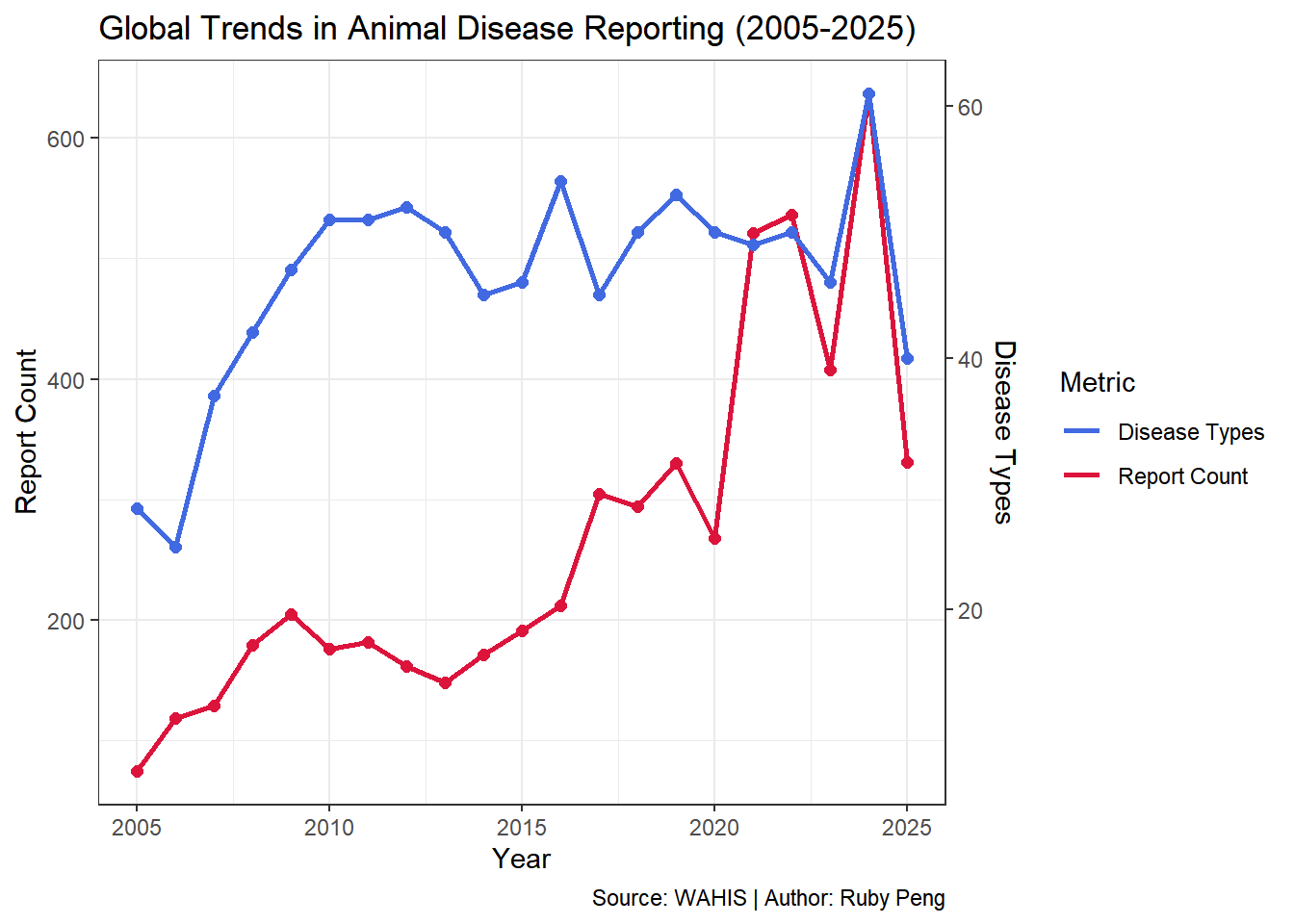
Q1:In general, what trends have been observed in the number of reports and the number of disease types globally over the past 20 years?
# To get the global numbers from 2005 to 2025df_global_report <- df_clean |>group_by(year) |>summarise(reports_number =n(),diseases_type =n_distinct(disease) ) glimpse(df_global_report)
#Visualizationratio <-max(df_global_report$reports_number) /max(df_global_report$diseases_type)# Now use ggplot to help us visualizep1 <-ggplot(df_global_report) +# Number of reports-Left axisgeom_line(aes(x = year, y = reports_number, color ="Report Count"), linewidth =1.0) +geom_point(aes(x = year, y = reports_number), color ="#DC143C", size =2) +# Number of disease types-Right axisgeom_line(aes(x = year,y = diseases_type * ratio, color ="Disease Types"),linewidth =1.0) +geom_point(aes(x = year,y =diseases_type * ratio), color ="#4169E1", size =2) +# Considering that the years are too dense, here we have not chosen to present the specific number of each year.# Set the two axisesscale_y_continuous(name ="Report Count",sec.axis =sec_axis(trans =~ . / ratio, # 反向转换name ="Disease Types" ) ) +# Set the color and labsscale_color_manual(values =c("Report Count"="#DC143C", "Disease Types"="#4169E1")) +labs(title ="Global Trends in Animal Disease Reporting (2005-2025)",x ="Year",color ="Metric",caption ="Source: WAHIS | Author: Ruby Peng" ) +theme_bw()
Warning: The `trans` argument of `sec_axis()` is deprecated as of ggplot2 3.5.0.
ℹ Please use the `transform` argument instead.
print(p1)
# Save plot as PNGggsave("out/timeline.png", plot = p1, width =8, height =6, dpi =300)
Q2:Disease type: What are the top 10 animal diseases with the highest number of reports globally over the past 20 years?
df_plot1 <- df_top10_diseases |>left_join(top10_disease_abbr, by =c("disease"="disease_full"))
Visualization
p2 <-ggplot(df_plot1, aes(x = year, y = report_count, color = disease_abbr)) +geom_line(linewidth =0.5) +geom_point(size =0.8) +labs(title ="Top 10 Animal Diseases Trend Globally (2005-2025)",x ="Year",y ="Report Count",color ="Disease" ) +theme_bw() +facet_wrap(~ disease_abbr, ncol =3, scales ="free_y") +# Before "free_y" was set, the line is very close to the x-axis following an identical scale. It didn't work well, so this step was addedscale_y_continuous(expand =expansion(mult =c(0.1, 0.1)) ) +theme(strip.text =element_text(size =8, face ="bold"), )ggplotly(p2)
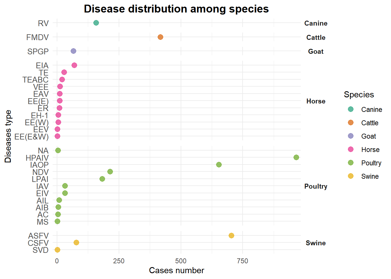
p3 <-ggplot(df_plot2,aes(x = cases, y =reorder(disease_abbr_2, cases), color = species)) +geom_point(size =3, alpha =0.7) +facet_grid(species ~ ., scales ="free_y", space ="free_y") +labs(title ="Disease distribution among species",x ="Cases number",y ="Diseases type",color ="Species" ) +theme_minimal() +theme(axis.text.y =element_text(size =10),strip.text.y =element_text(angle =0, face ="bold"),plot.title =element_text(hjust =0.5, face ="bold", size =14),panel.spacing =unit(0.5, "lines") ) +scale_color_brewer(palette ="Dark2")+scale_x_continuous(expand =c(0.02, 0)) print(p3)
# Save plot as PNGggsave("out/distribution.png", plot = p3, width =8, height =6, dpi =300)
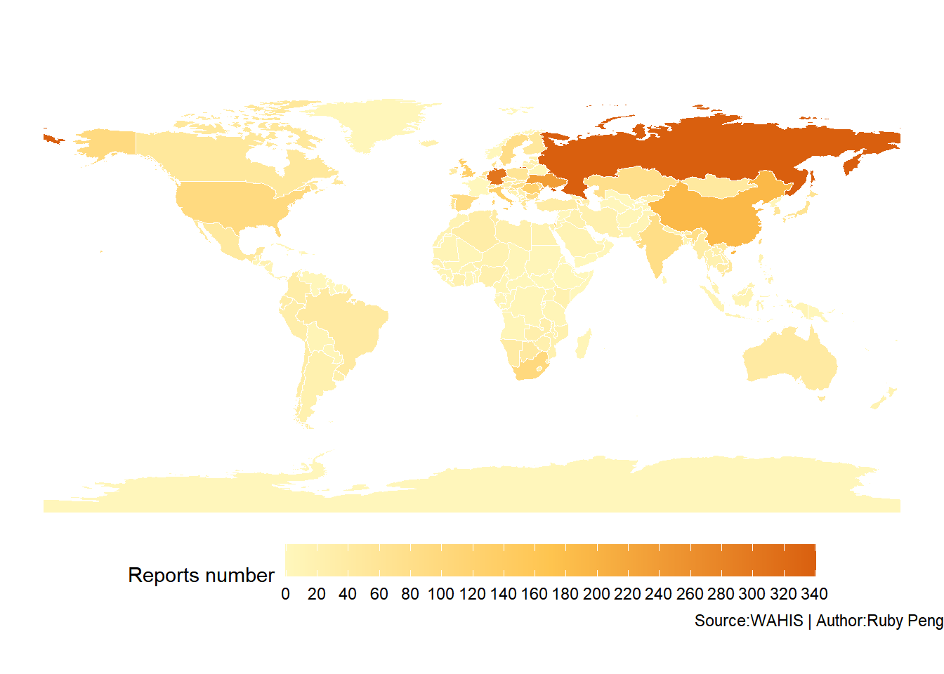
Q4: Geographical view:What is the global distribution of the total number of animal disease reports by country?
df_country <- df_clean |># Standardized country names mutate(country =case_when( country =="China (People's Rep. of)"~"China", country =="Korea (Rep. of)"~"South Korea", country =="Türkiye (Rep. of)"~"Turkey", country =="Central African (Rep.)"~"Central African Republic", country =="Dominican (Rep.)"~"Dominican Republic", country =="Serbia and Montenegro"~"Serbia", country =="Ceuta"~"Spain", country =="Melilla"~"Spain",TRUE~ country ) ) |># Convert country name to ISO3 codemutate(country_iso3 =countrycode(country, "country.name", "iso3c")) |># Get the number of reports for each countrygroup_by(country_iso3) |>summarise(total_cases =n())# Get the data of world mapworld_map <-ne_countries(scale ="medium", returnclass ="sf") |>select(iso_a3, geometry)# Combine the roports data with world mapdf_country_merged <- world_map |>left_join(df_country, by =c("iso_a3"="country_iso3")) |>mutate(total_cases =replace_na(total_cases, 0)) # 将NA替换为0# Visualizationp4 <-ggplot(df_country_merged) +geom_sf(aes(fill = total_cases), color ="white", size =0.2) +scale_fill_gradientn(colours =c("#FFF7BC", "#FEC44F", "#D95F0E"),name ="Reports number",breaks =seq(0, max(df_country_merged$total_cases, na.rm =TRUE), 20),na.value ="grey90" ) +labs(title ="Distribution of global animal disease reports(2005-2025)",caption ="Source:WAHIS | Author:Ruby Peng" ) +theme_void() +theme(legend.position ="bottom",plot.title =element_text(hjust =0.5, face ="bold"),legend.key.width =unit(2, "cm") )print(p4)
# Save plot as PNGggsave("out/map.png", plot = p4, width =8, height =6, dpi =300)